LODGECRAFT
LAB
My role
Solo: research, information architecture, UI, copy, prototype, motion
Timebox
6–8 hours over three days
Delivered
Desktop 1440 + mobile 390, both CTA flows with all states, Figma prototype, 5-minute video walkthrough
Tools
Figma (styles, components, prototype), HTML prototype built with AI-assisted code to test motion and responsiveness
This was a take-home challenge from a hiring process. The company, brands, people, photography and numbers have been replaced: the photos come from Pexels and the stats are examples. The structure, flows, copy and design decisions are mine and haven't changed.
ONE PAGE.
TWO OFFERS.
TWO KINDS OF VISITOR.
Lodgecraft runs furnished apartments across Europe, and built its own property software, Baseline, to run them. The Lab is where its founders teach others to do the same.
The page had to convert two audiences who want different things: people with a 9-to-5 who haven't opened a unit yet, and operators who already run a few and are stuck on manual work and thin margins. Both are sceptical, because this market is full of "passive income" gurus.
The brief asked for a "wow" effect, clear value and conversions, plus a secondary capture for people not ready to commit.
Path 01 · Starting out
LAUNCH
Commitment on this page: a free live webinar. Then a one-off course.
Path 02 · Already running units
SCALE
Commitment on this page: a free 30-minute strategy call. Then a 12-week programme with the software.
Launch leads. Scale is never hidden.
Most visitors are beginners, so the webinar gets the button. But an operator landing on a page that only talks to beginners leaves, so the strategy call sits right under it as a text link: a second path at a glance, without two buttons competing for the same click.
- The link is stacked under the button, not beside it: clearer hierarchy and more breathing room.
- Further down, the two programme cards show the same hierarchy through weight: Launch is a solid blue block, Scale is lighter.
- Both offers still get flows of the same depth, from button to confirmation.
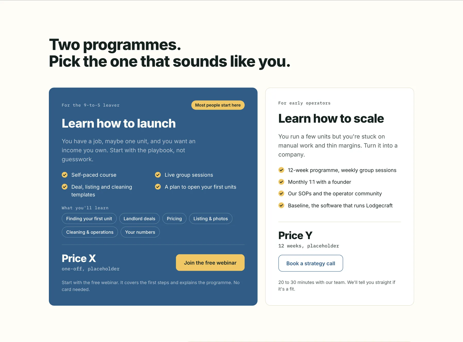
Value before price.
Nobody pays on this page, because the real commitment is the free webinar or call. Showing price cards early would make it read like a sales page to a visitor who's already wary of gurus. So I reordered it: hero → proof → what you get → how it starts → founders → programmes and price → FAQ → checklist.
- "What you get" is split into two tiers, Launch + Scale and Scale only, joined by an ochre "+" so the two offers read as a ladder.
- Trust (the founders) sits right before the price.
- The question "why pay, when videos are free?" is answered by the page itself, not by an FAQ entry. The FAQ only handles practical objections.
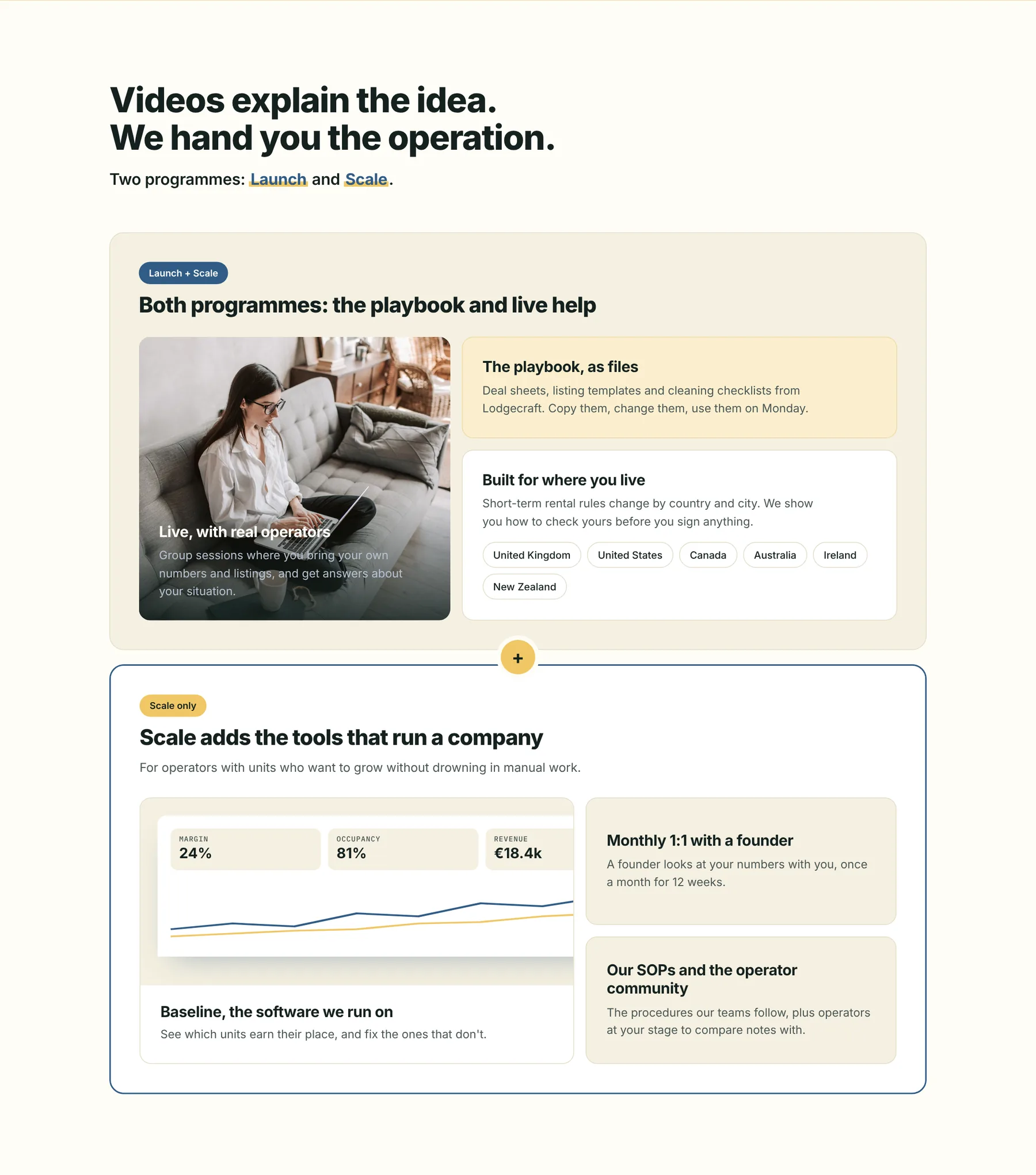
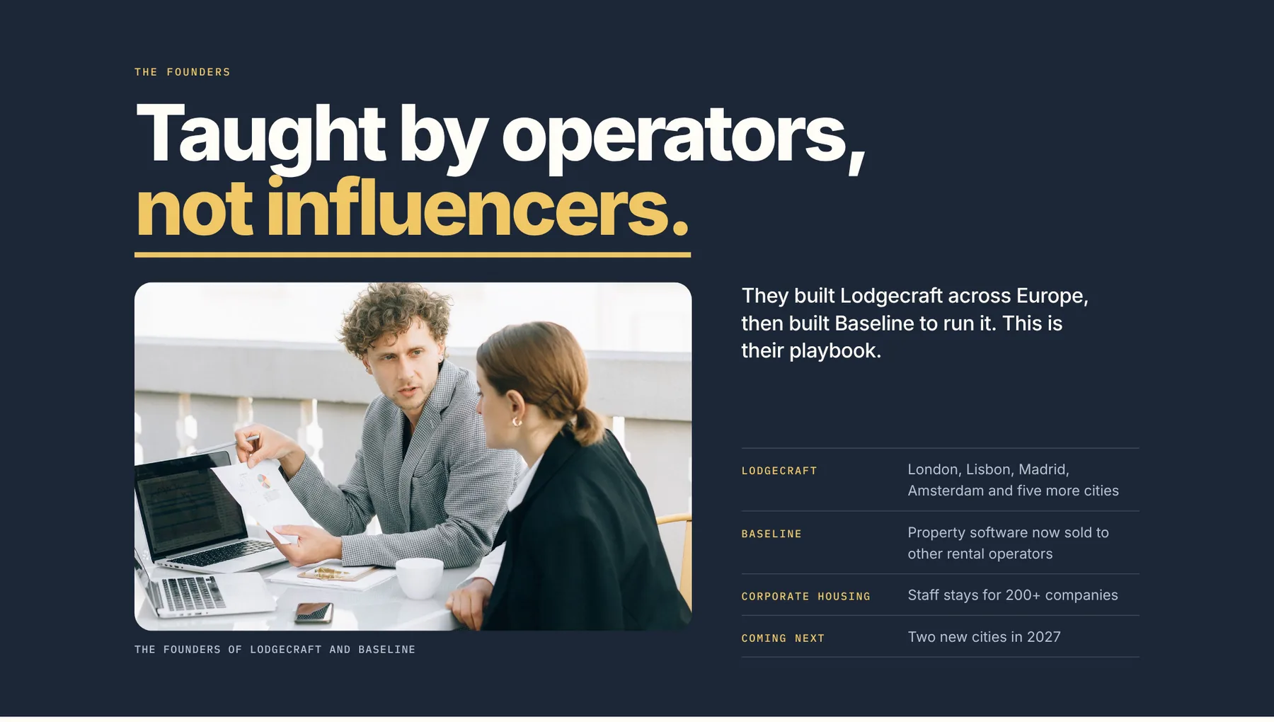
The founders block uses the same giant editorial type as the hero. It's the only dark block on the page, placed right before the price.
A brother brand, not a son.
The Lab had to feel related to two existing brands: the rental company (cream, warm photography, a sans) and the software (mono labels, pill chips, 12px radius). I combined the systems instead of averaging their colours: a midpoint colour turned into a muddy SaaS blue-green and lost the warmth.
At first I used the parent brand's green, but with the same structure and cream it made the Lab a twin. Palette is noticed far more than type, so the Lab got its own slate blue, plus an ochre pushed from the parent's yellow.
Blue for acting
Every button is blue: it's the highest contrast on cream. The one exception is the ochre button on the blue Launch card, where a blue button would disappear.
Ochre for noticing
Ochre marks what the eye should land on: the "you own." highlight, the proof band, the first webinar step, "not influencers." I caught myself writing "ochre is where your eye goes" while every CTA was green, and that contradiction became the rule.
One CTA in view at a time.
"Join the free webinar" was repeating everywhere and starting to feel pushy. Now the nav shows just the logo at the top. The two CTAs fade in only once the hero button has scrolled out of view, and inline buttons appear only where a path is explained. On mobile, a bottom bar with both CTAs does the same job.
- The webinar steps sit on an ochre curve that rises and draws itself on scroll, so progress reads as going up. On mobile it becomes a vertical timeline.
- Motion is minimal and plays once: 1.8s line, steps popping as the line reaches them, all off under reduced motion.
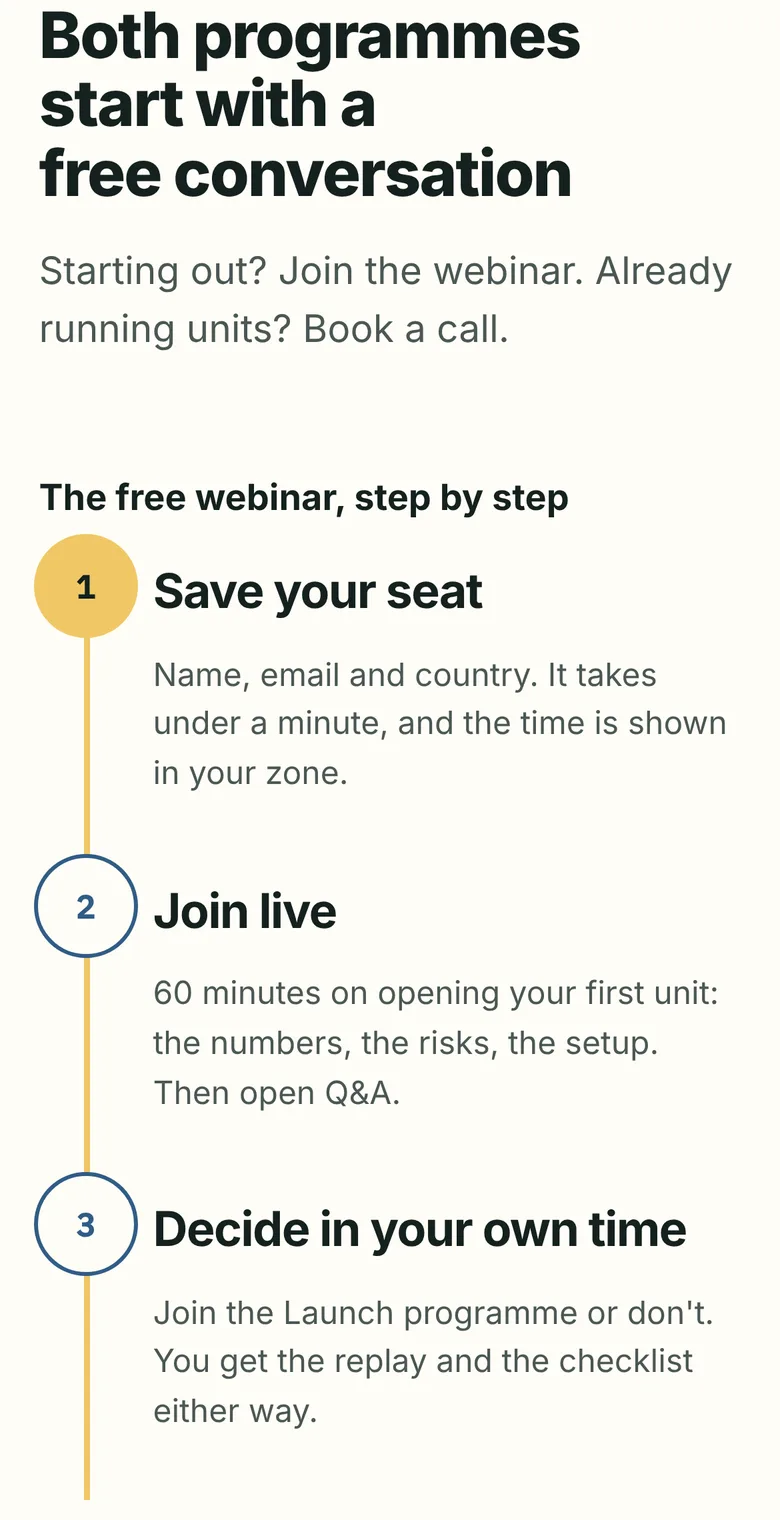
Mobile 390: the curve becomes a vertical timeline.
Both flows, button to confirmation.
The draft copy promised a webinar "at 7pm in your time zone", which a single live session can't do. I replaced it with two sessions (Europe and Americas evenings), pre-selected from the visitor's country and shown in local time. The strategy call keeps the calendar inside the page instead of handing off to a booking tool.
- Visitors who pick "None yet" in the Scale form are sent to the webinar, with a "continue anyway" link so nobody is blocked.
- Two fields beyond the brief, both justified: the session picker (pre-filled, zero effort) and country (sets currency and time zone).
- Every CTA is drawn in default, hover, pressed, focus, submitting and success states.
The webinar flow in the HTML prototype, start to finish.
Launch · Free webinar
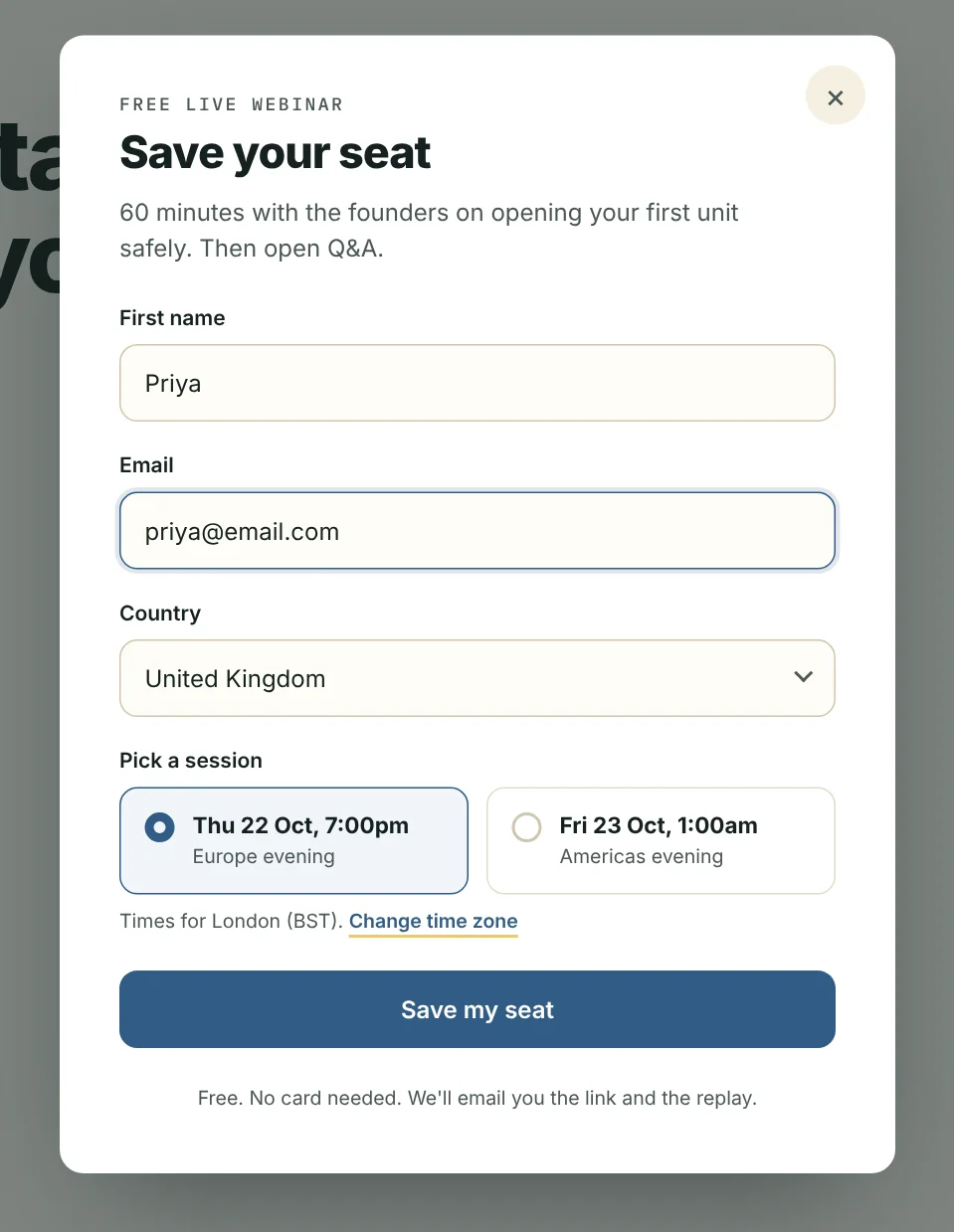
Register: four fields, session pre-selected
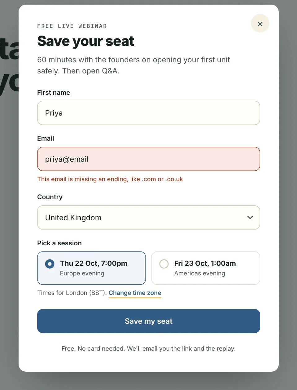
Inline error that says how to fix it
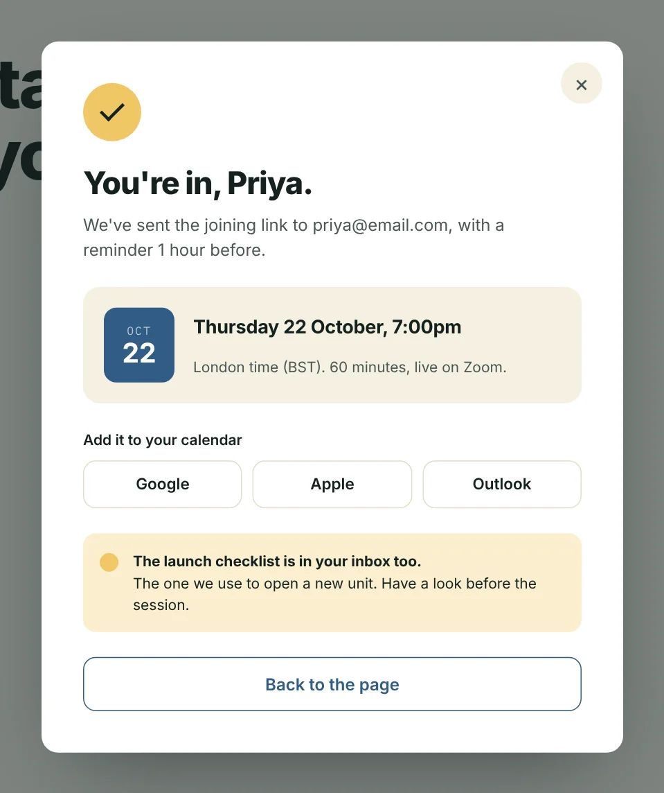
Confirmed: local time, add to calendar, checklist sent
Scale · Strategy call
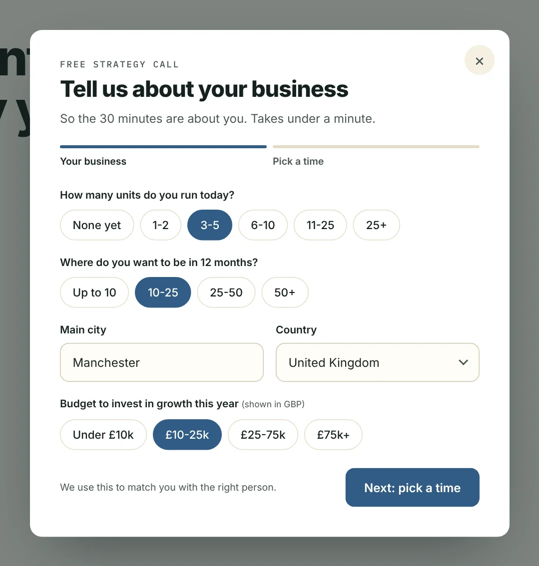
Qualify with chips, under a minute
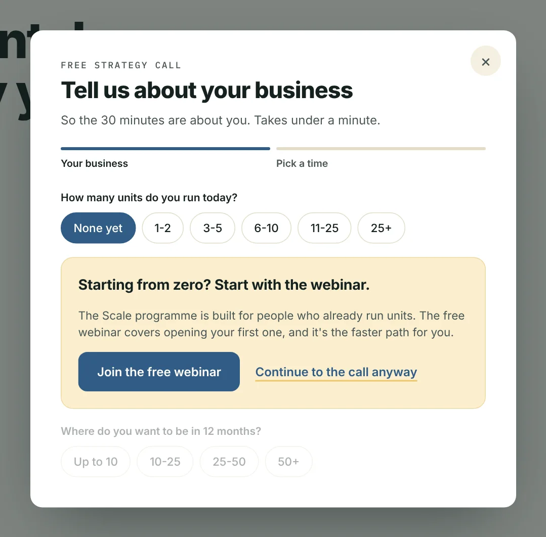
"None yet" → routed to the webinar, never blocked
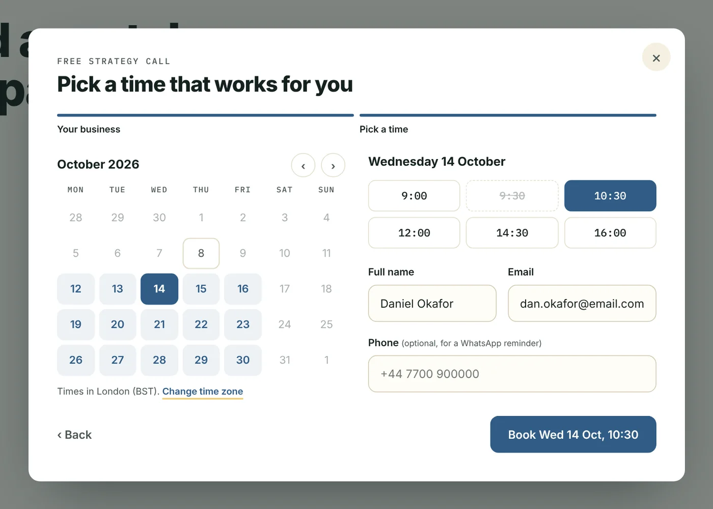
Calendar inside the page, time zone visible
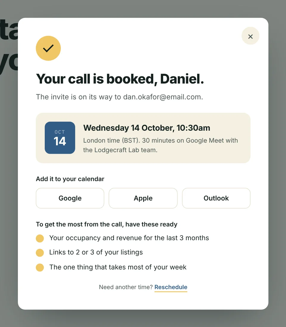
Booked: three things to prepare, easy reschedule
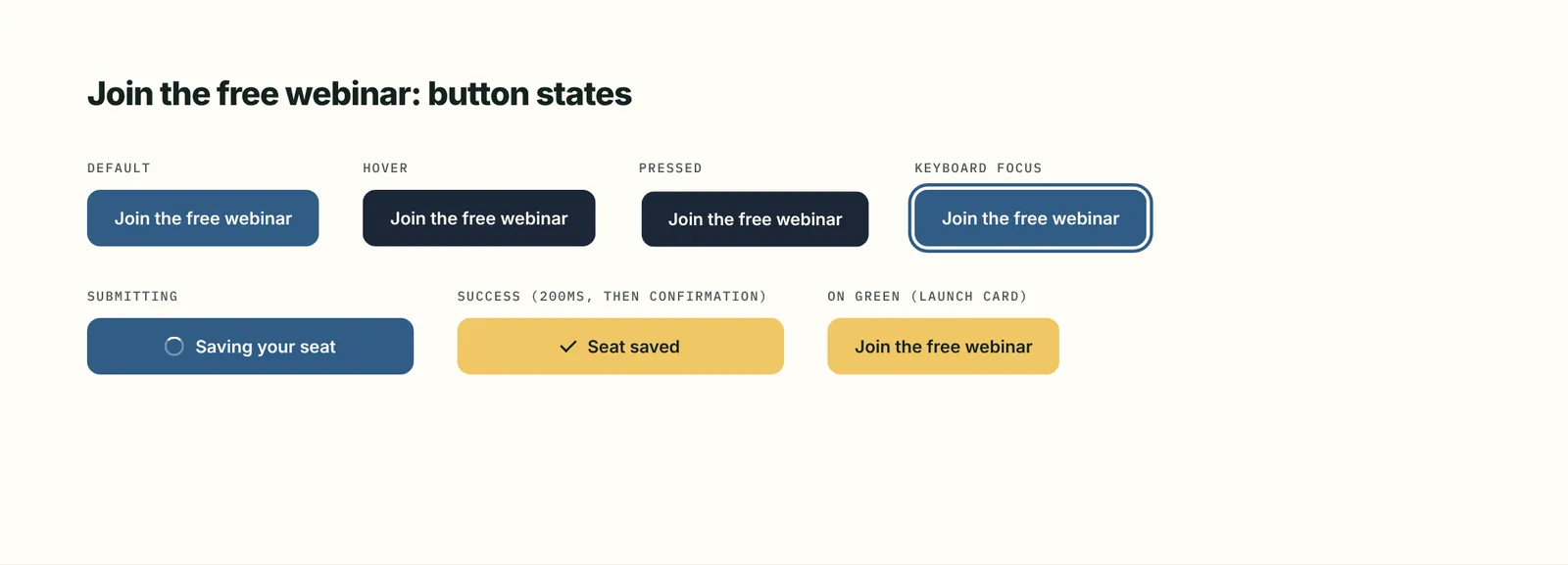
CTA states
NO FAKE
PROOF.
The Lab was new, so there were no testimonials yet. I didn't invent any. Proof comes from the parent company's real operating numbers, and testimonials get added after the first cohort. I also left out corporate client logos: they'd imply those clients endorse the academy, which they don't.
The checklist capture asks one question, "starting out or already running units?", and sends a different checklist to each. That fixed a mismatch in the brief, where a single lead magnet served two audiences.

Proof band. Numbers here are examples.
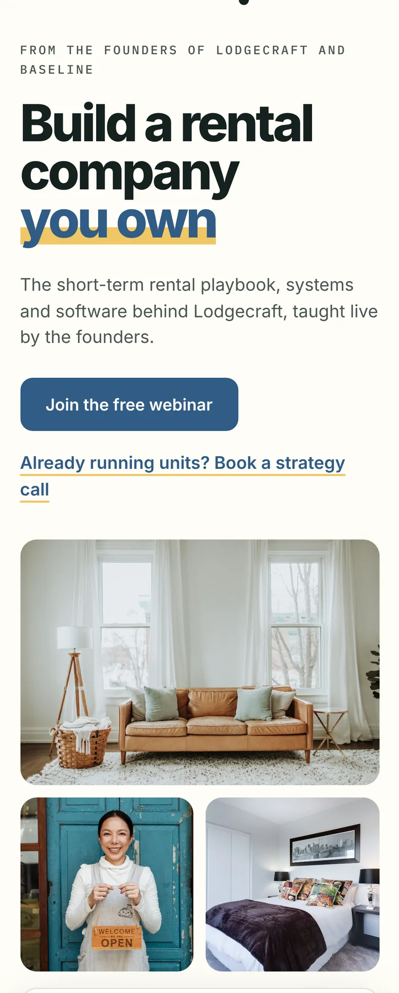
Mobile 390: hero
WHAT I'D DO NEXT
LIKED THIS PROJECT?
LET'S TALK.
I'm open to UX/UI and product design roles. Write to me, or grab my CV.
micaelagiannetti94@gmail.com