INSIDE
A psychological journey
My role
Solo project: concept, writing, digital paintings, interaction design and the Swift Playground
Context
Apple's WWDC Swift Student Challenge, where students submit one Swift Playground
Platform
iPad, touch and Apple Pencil
Illustration
Every character and scene painted by me in Procreate, in two states
A SIMPLE DESIGN.
A POWERFUL
MESSAGE.
The Swift Student Challenge asks for one playground that shows creativity, technical skill and meaningful design, and it has to make its point in a few minutes.
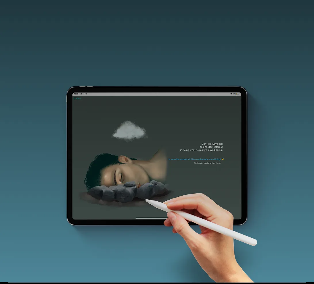
I wanted to talk about mental health without lecturing. Inside takes the user into the inner world of people living with conditions like anxiety, depression and OCD. Each scene presents a character in distress. To move on, the user has to understand what that person is going through and do the right thing to help them feel better. The goal is an experience that's emotional and educational at the same time.
One loop, learned once.
The interaction is deliberately minimal: the emotional weight comes from the images and the story, not from complexity. Every scene follows the same four steps, so after the first one the user stops learning the interface and just pays attention to the person in front of them.
01
Read the scene
Each chapter presents a condition through a character's illustrated state. Context is short and accessible, never clinical.
02
See two states
The same person is drawn twice: in distress, and relieved. The contrast makes the emotional change visible.
03
Act
The user performs one small gesture tied to the scene, like dragging a cloud away.
04
Transform
The character goes from distress to relief, and the scene closes.
The illustrations are the interface.
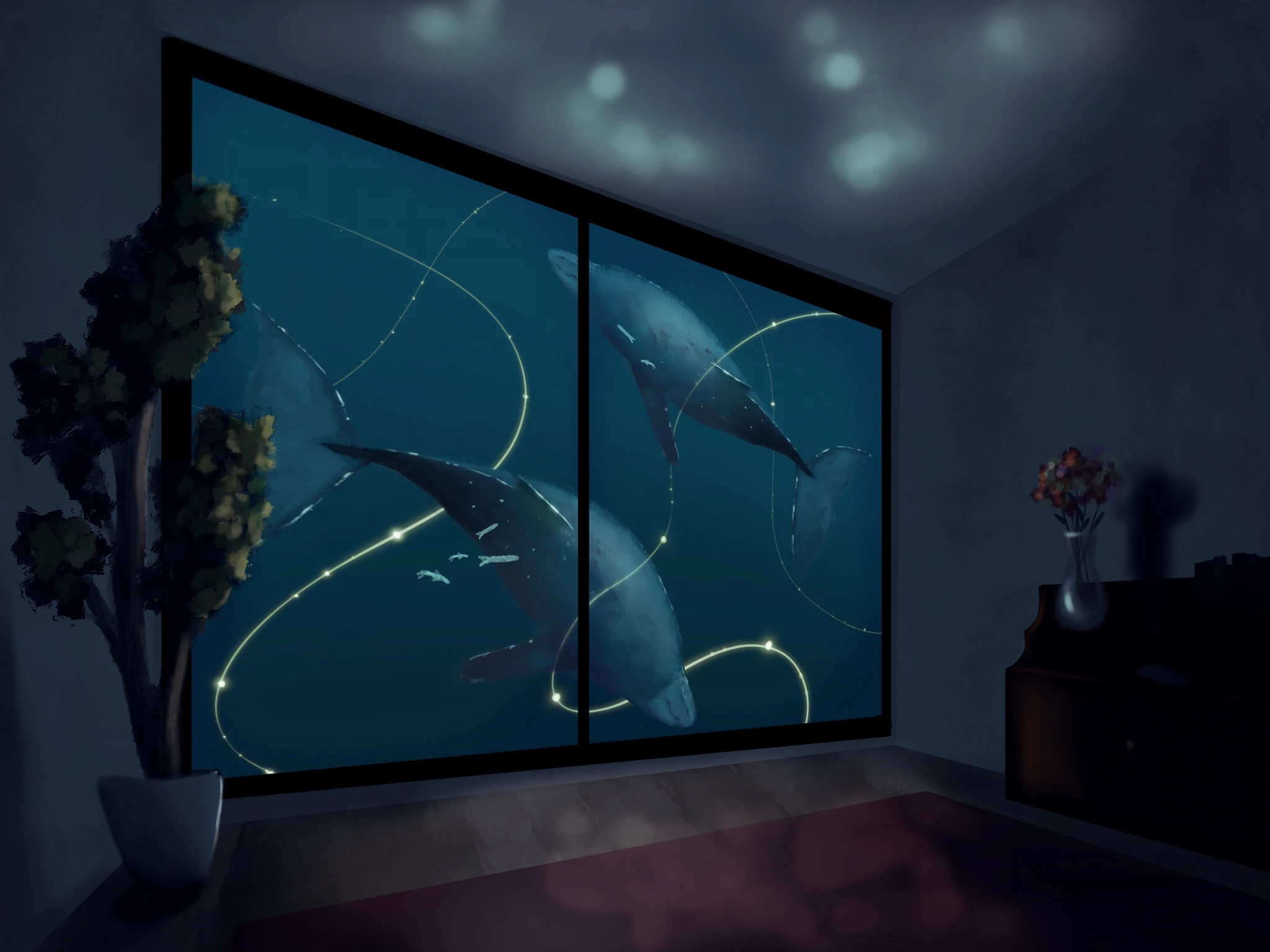
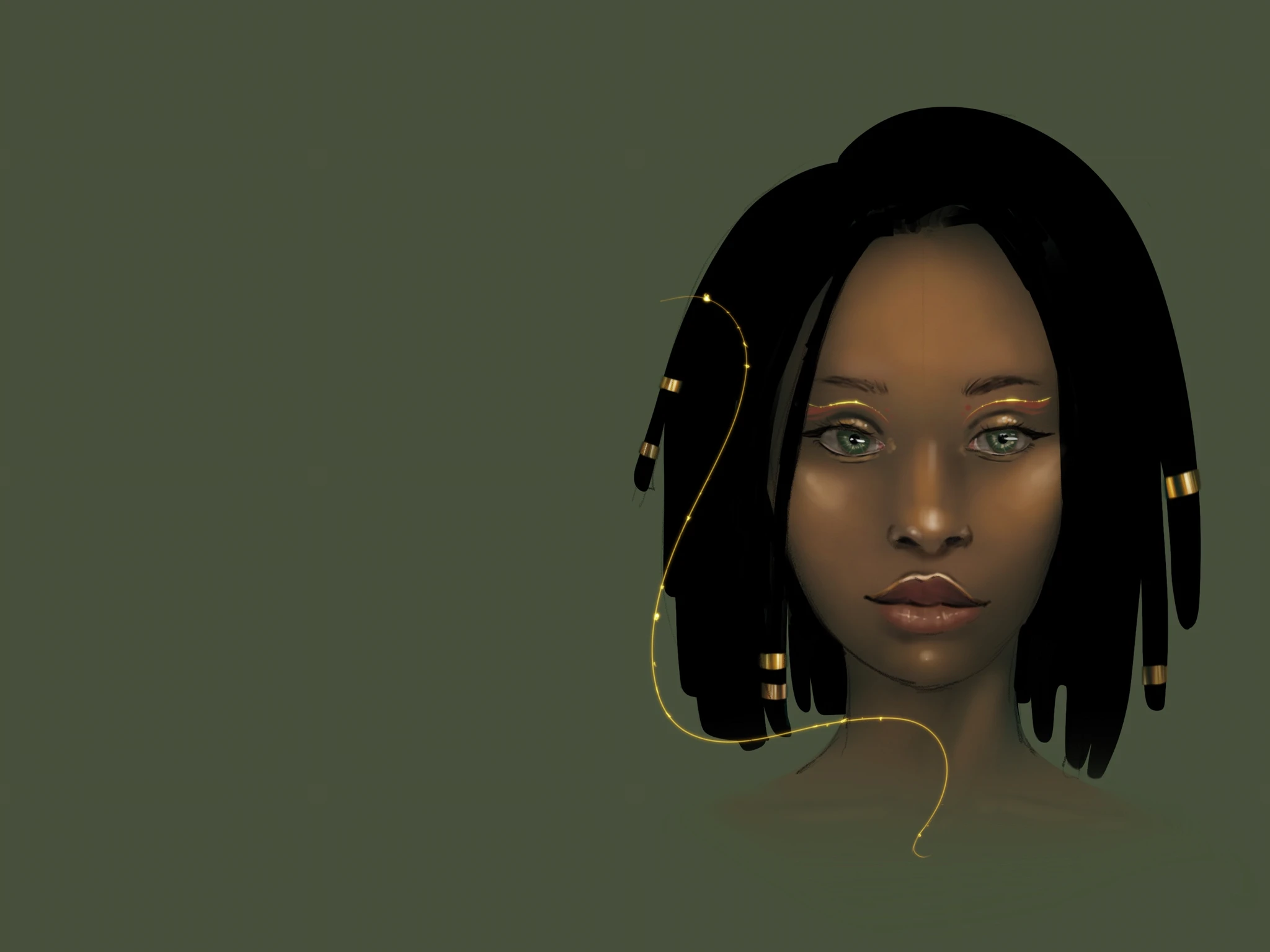
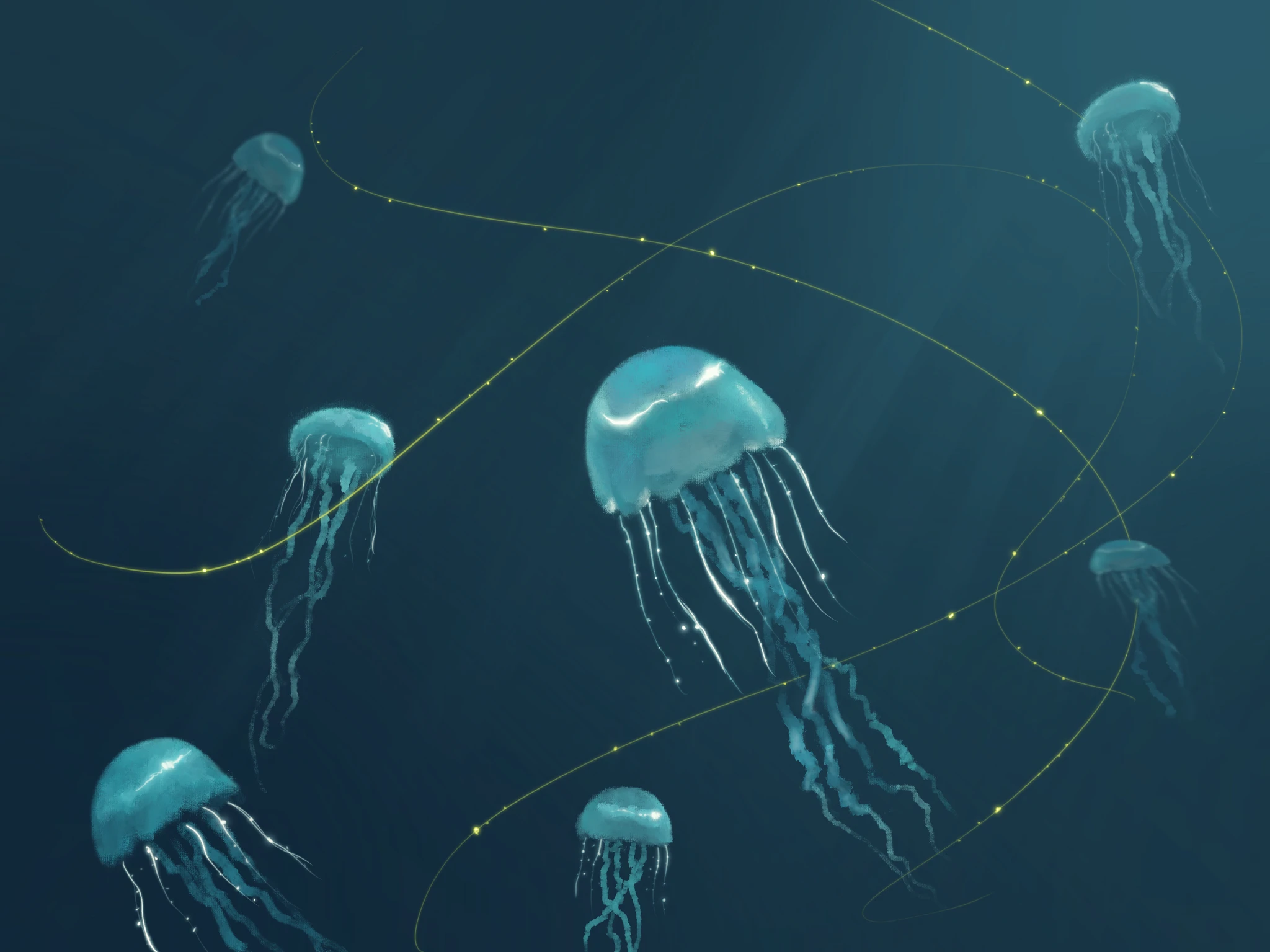
There's almost no UI, so the drawings have to tell the story. I painted every character and scene myself in Procreate, each character in two states: the same person before and after the user's gesture. The visual language is warm and expressive, and deliberately not clinical, so the scenes feel like people rather than case studies.
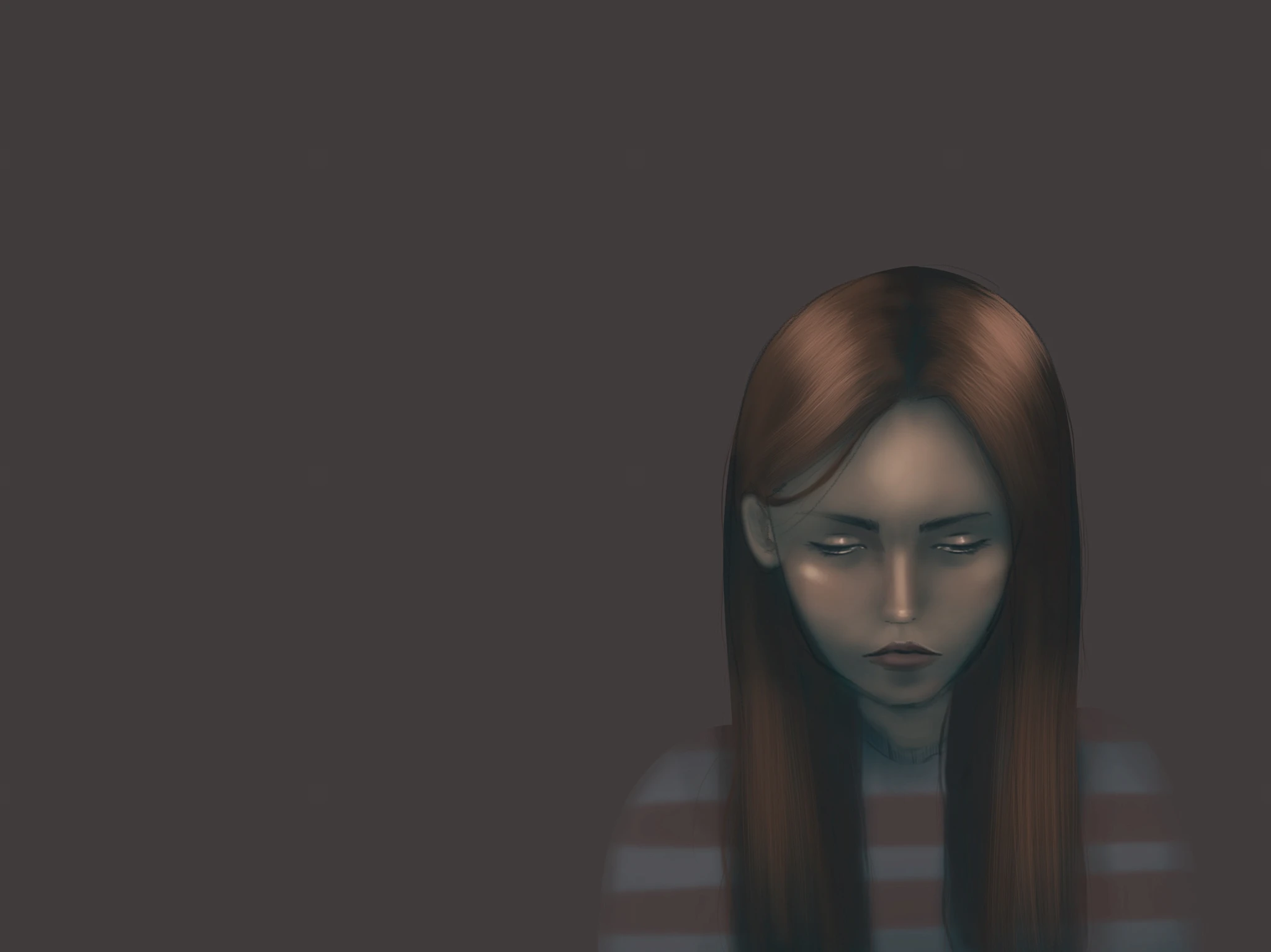
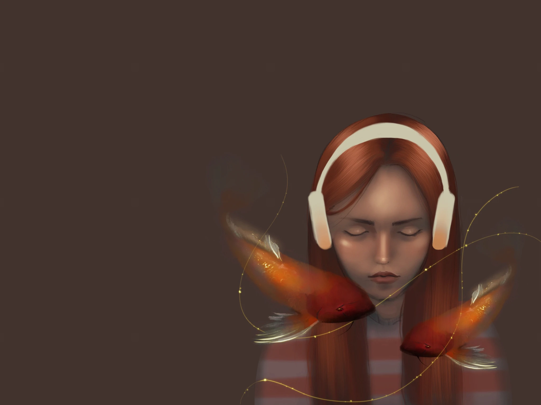
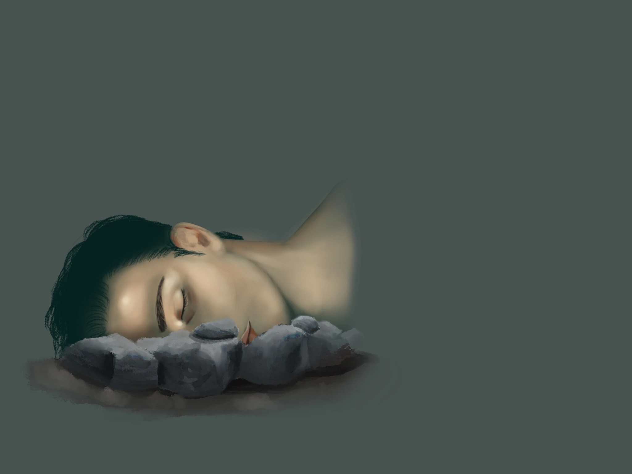
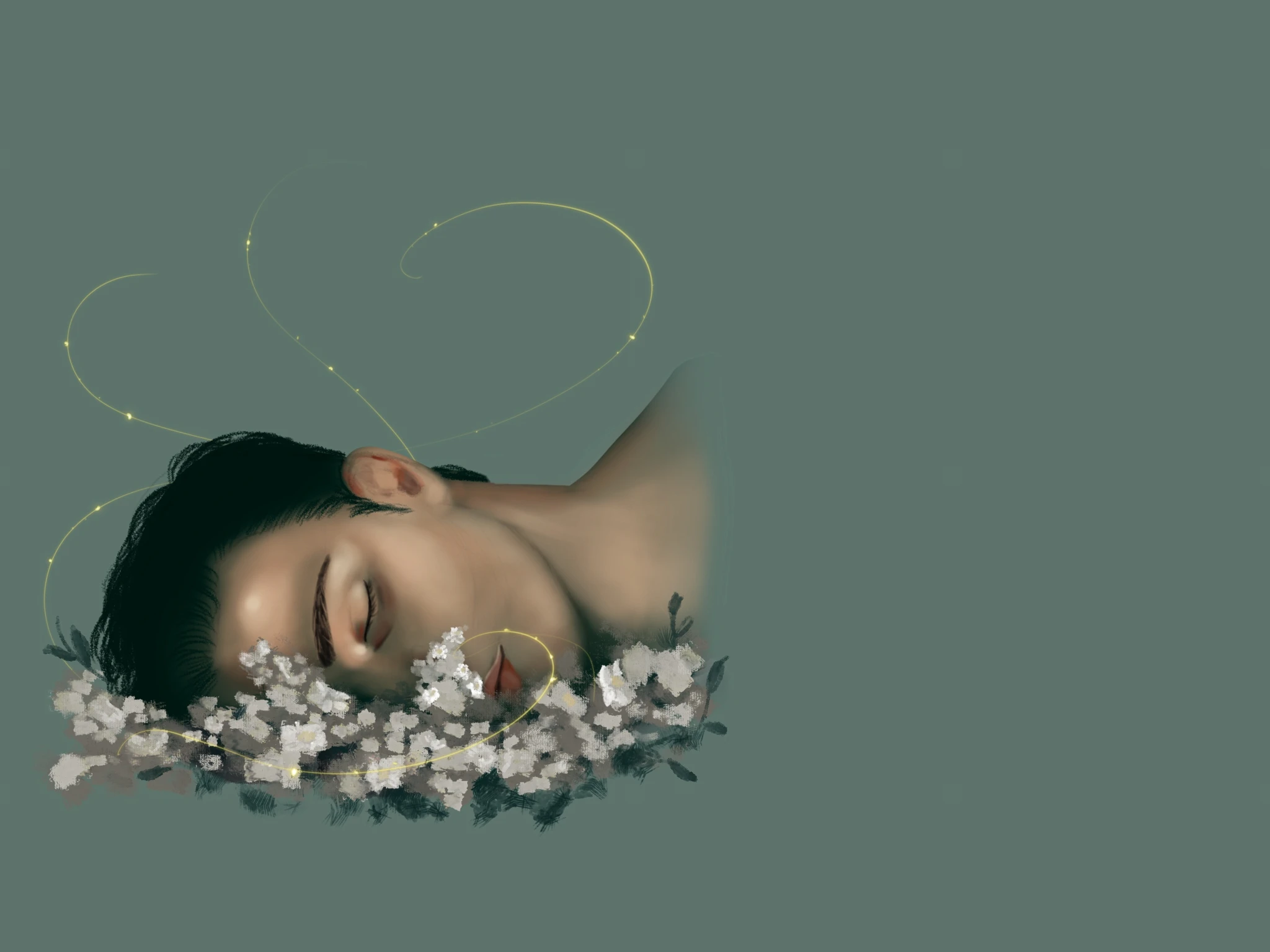
Before and after the user's gesture
The user is the helper.
The user doesn’t just watch the person on screen: they’re the one who helps. First you understand what’s happening, then you act.
Minimal friction
As few interface elements as possible. No menus, no complex navigation: all the attention goes to the story and the character.
Empathy by design
Understanding comes before acting. Each step is there to build awareness of what living with a mental health condition can feel like.
LIKED THIS PROJECT?
LET'S TALK.
I'm open to UX/UI and product design roles. Write to me, or grab my CV.
micaelagiannetti94@gmail.com